For years I’ve been taking photos of interiors. As a real estate photographer that can be at a large variety of locations and all different interiors. Within my work you sometimes come across a diamond of an apartment. I want to give you a peek into this apartment in one of the most beloved streets of Stockholm.
Al jaren maak ik foto's van interieurs. Als vastgoed fotograaf kan dat op uiteenlopende locaties zijn en met allerlei verschillende interieurs. Binnen mijn werk kom je soms een pareltje van een appartement tegen. Ik wil jullie een kijkje geven in dit appartement in een van de meest geliefde straten van Stockholm.
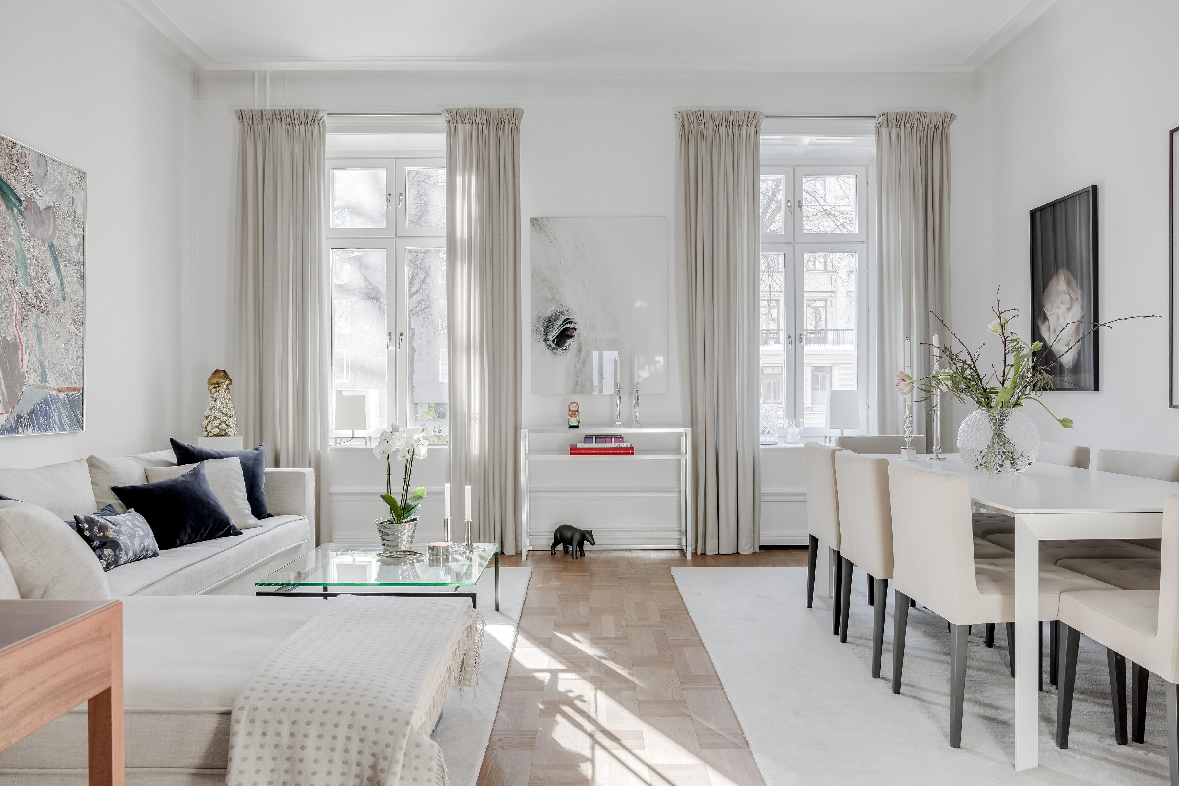
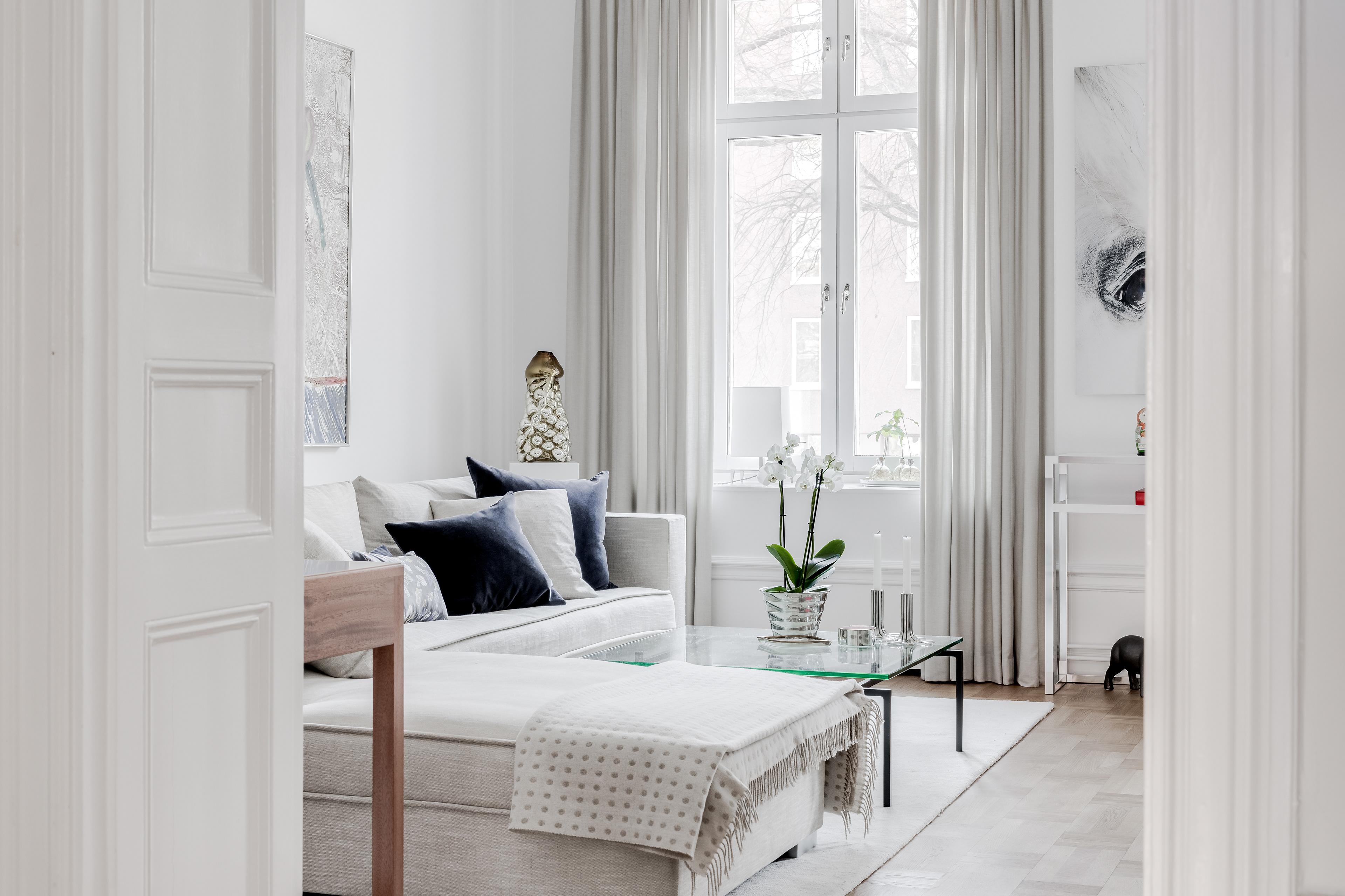
The base of the apartment is very light and has a lot of natural colors which goes perfectly together with the wooden floor and some colorful accents. If you are into art this apartment can be definitely a good source of inspiration. It shows how you can add paintings to your interior without losing the calm feeling. If I speak for myself, I find that a bit hard sometimes. At home we have a trilogy of paintings above the sofa in the living room, but I feel a bit insecure what kind of art goes well together in the same room.
De basis van het appartement is heel licht en heeft veel natuurlijke kleuren die perfect samengaan met de houten vloer en enkele kleurrijke accenten. Als je van kunst houdt kan dit appartement zeker een goede bron van inspiratie zijn. Het laat zien hoe je schilderijen kunt toevoegen aan je interieur zonder het rustige gevoel te verliezen. Als ik voor mezelf spreek, vind ik dat soms nog moeilijk. Thuis hebben we een drieluik boven de bank in de woonkamer, maar ik voel me een beetje onzeker wat voor soort kunst goed bij elkaar past in dezelfde ruimte.
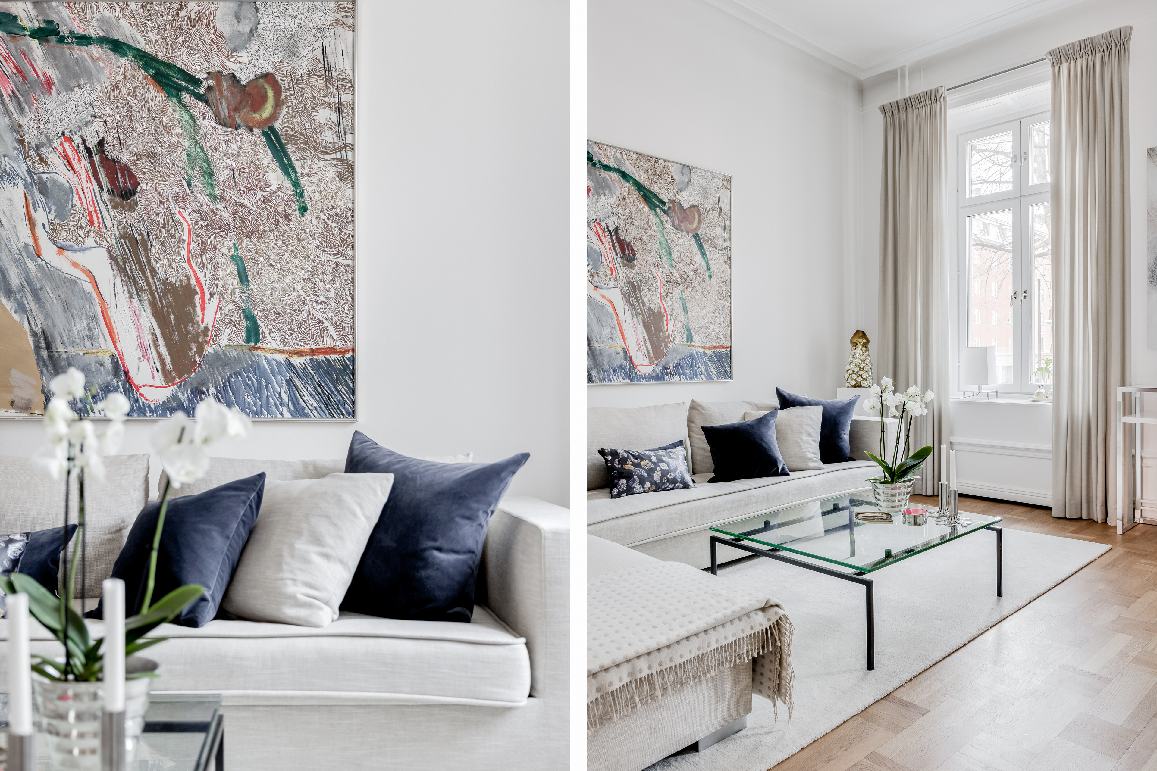
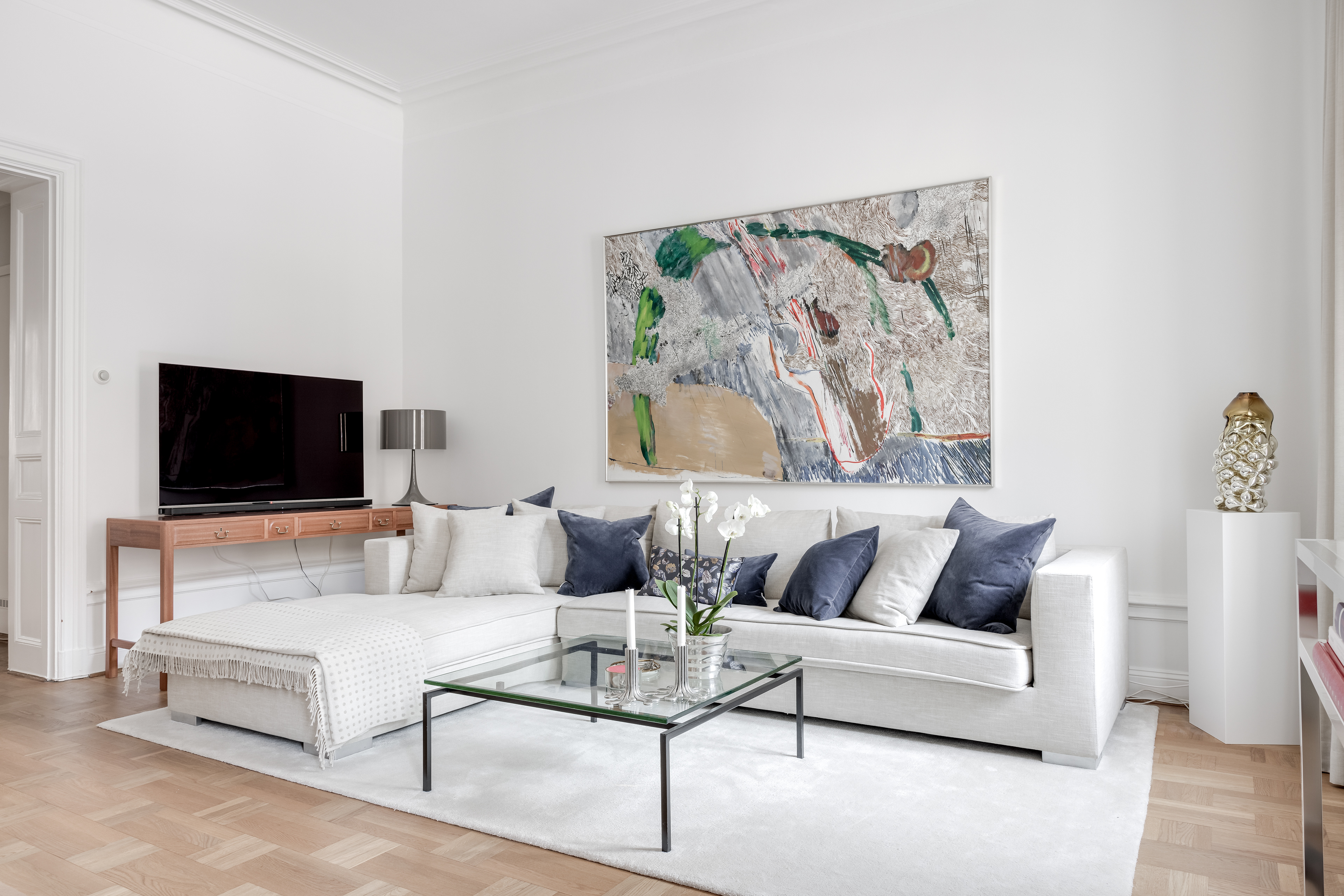
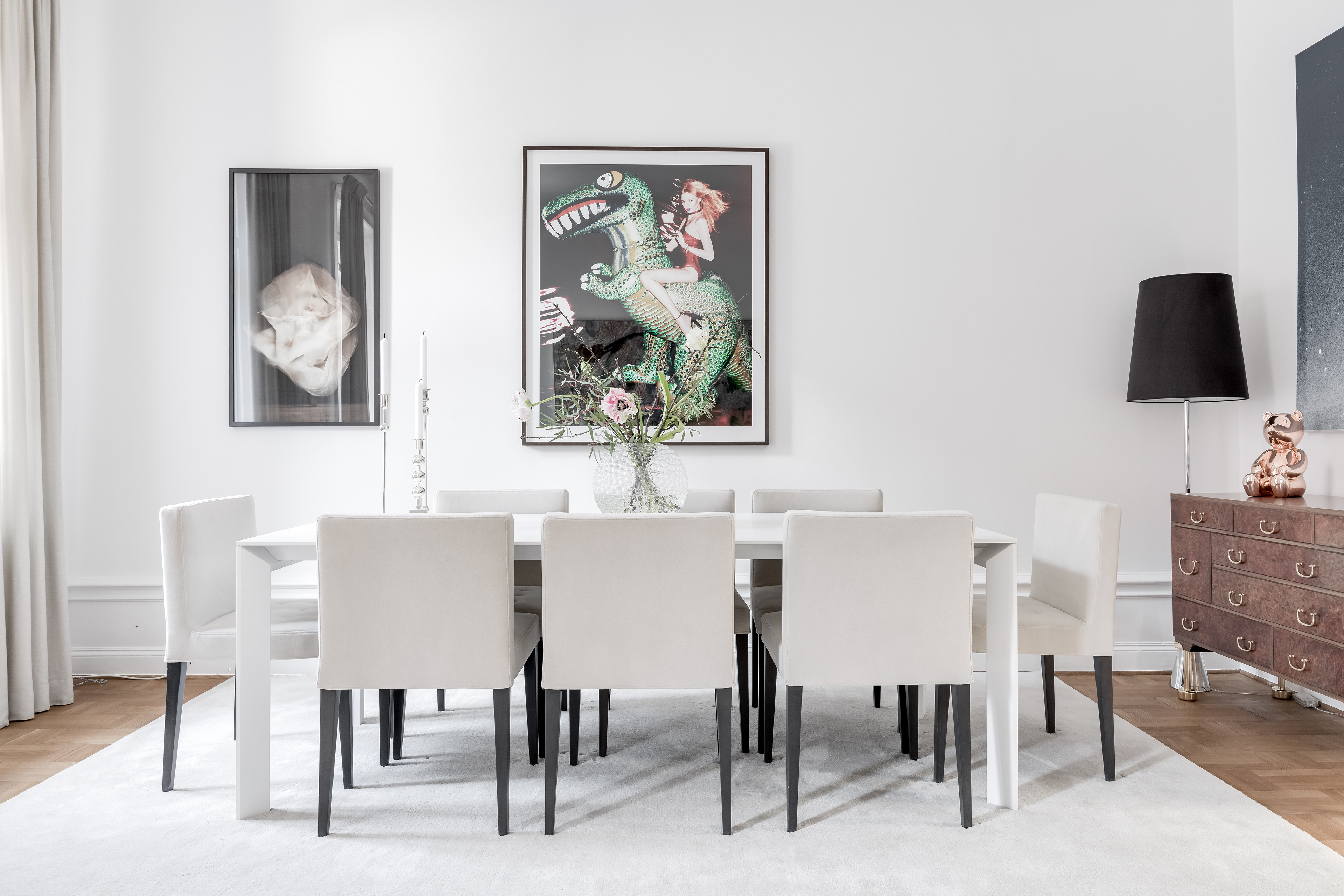
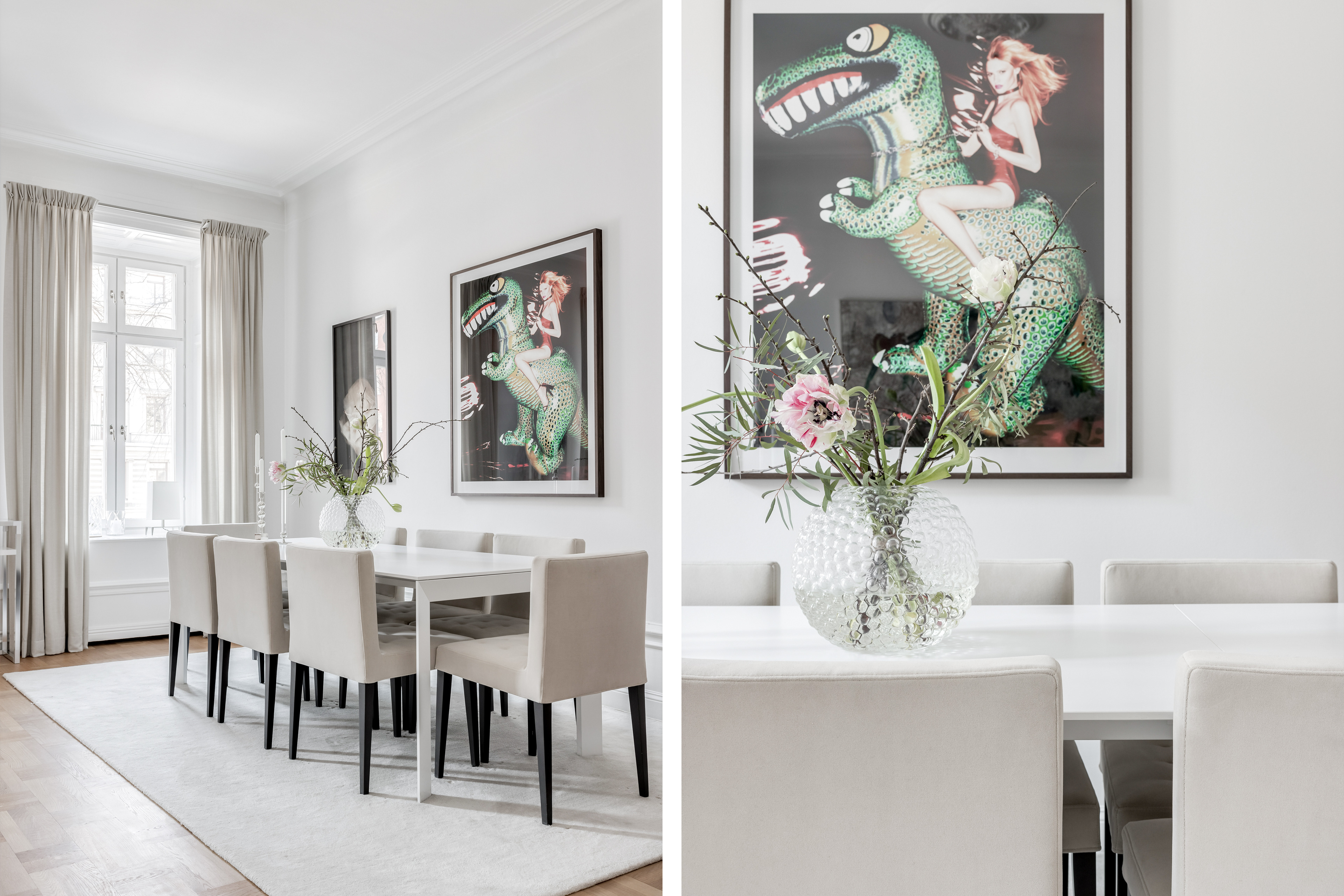
What I noticed within this interior is that the colors in the paintings come back in other items. You can find the green tones from the dinosaur in the flowers on the table and the black tones from both of the paintings in the legs of the chair. The left painting has a white/beige tone which goes very well with most of the items in the interior. At the same time they give some contrast in the whole setting that is mostly white. On the other side of the room, above the sofa there is a painting that includes a wider palette of colors. Beside the green tones, also a blue color which fits lovely with the pillows.
Wat me opviel in dit interieur is dat de kleuren uit de schilderijen terugkomen in andere voorwerpen. Je vindt de groene tinten van de dinosaurus terug in de bloemen op de tafel en de zwarte tinten van beide schilderijen in de stoelpoten. Het linker schilderij heeft de wit/beige tint die heel goed past bij de meeste voorwerpen in het interieur. Tegelijkertijd geven ze wat contrast in de hele omgeving die overwegend wit is. Aan de andere kant van de kamer, boven de bank, hangt een schilderij dat een breder kleurenpalet omvat. Naast de groene tinten, ook een blauwe kleur die mooi past bij de kussens.
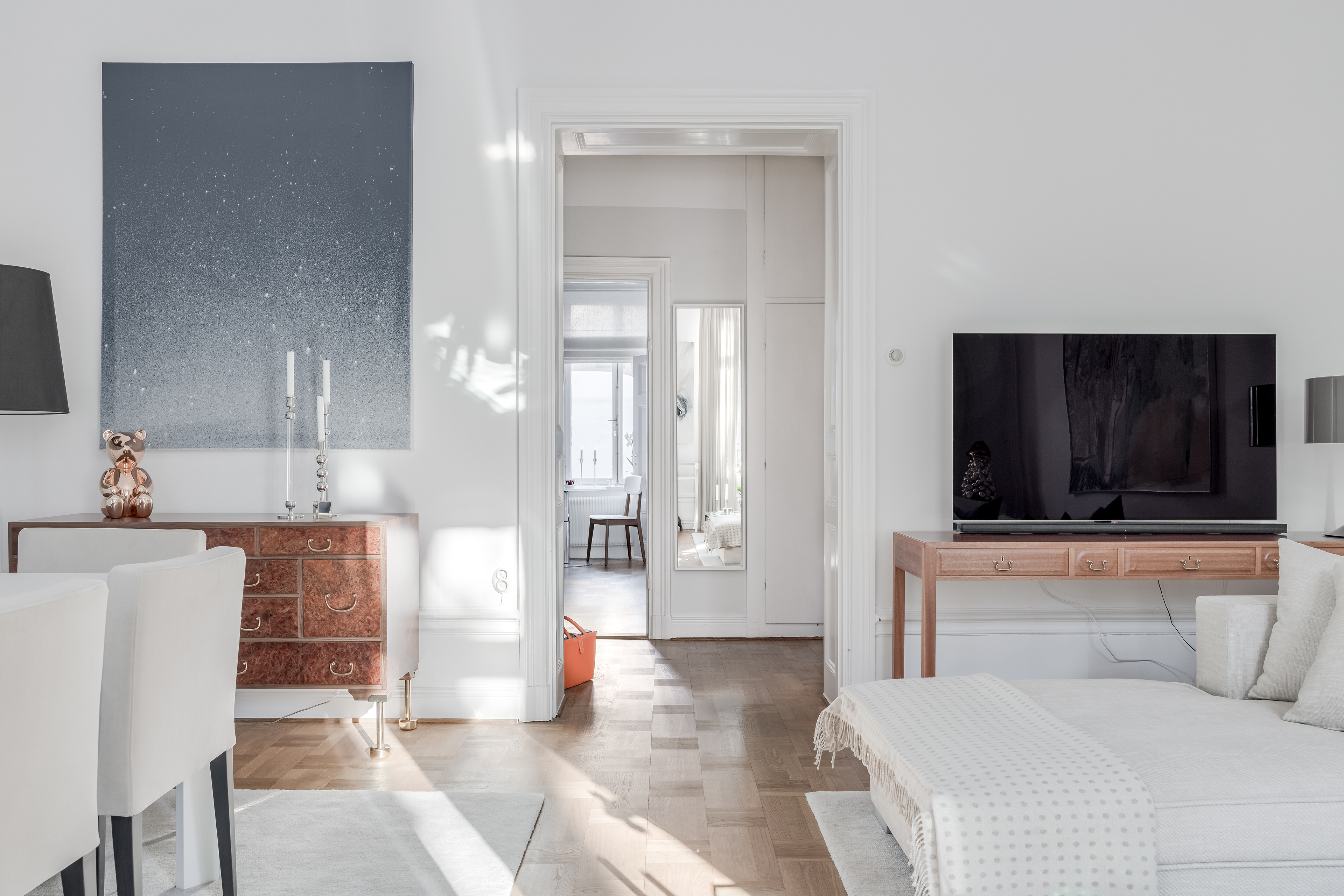
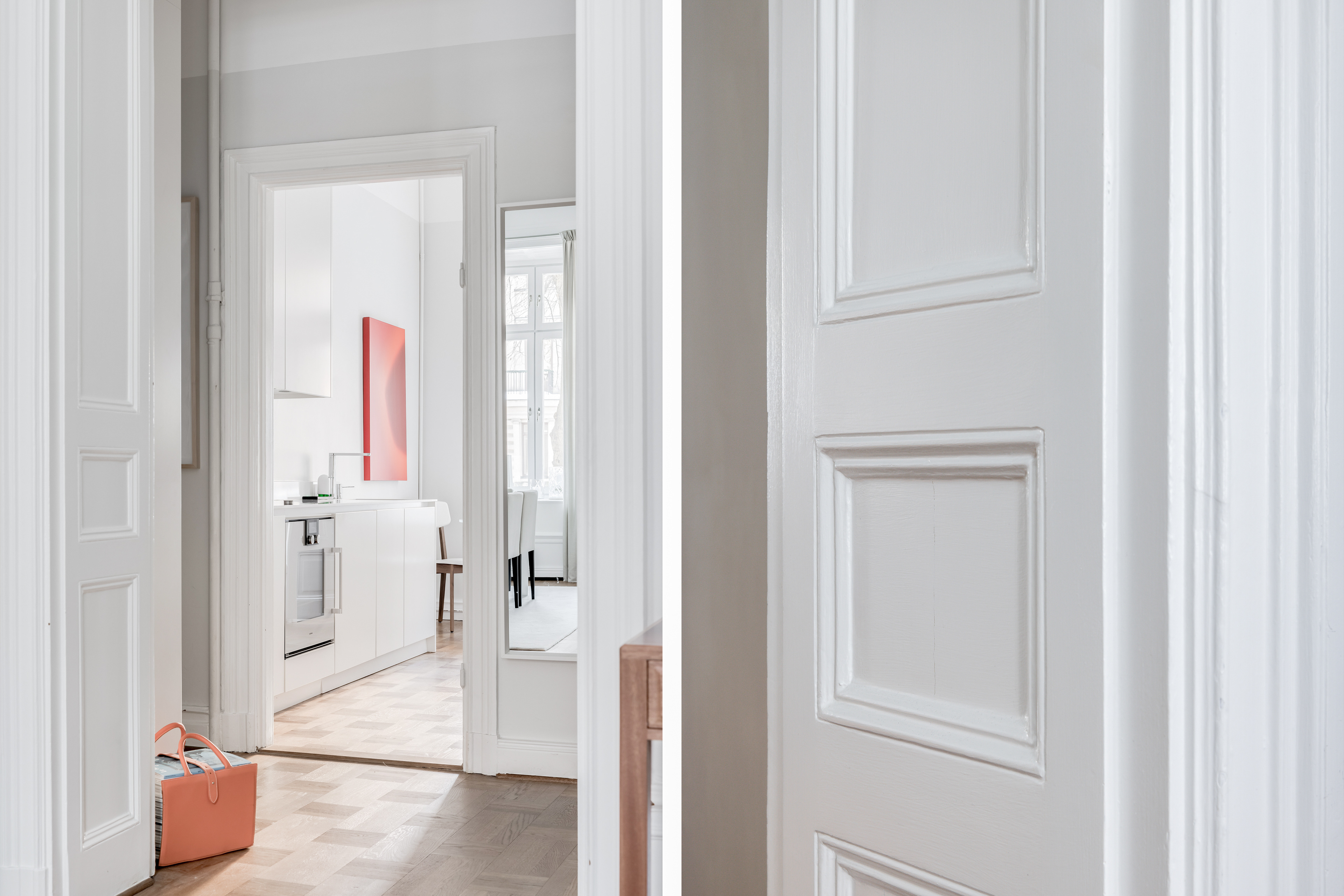
I always like to create these kinds of photos. It feels a little bit like a sneak peek into the next room. Of course it helps if the entrance has beautiful doors as is the case here. Many of the older buildings in Stockholm have elements like this and I think such details bring a specific atmosphere into an interior. If you can start decorating your interior with this as a base, you don’t even need that many accessories anymore. The building itself gives you already so much to work with.
Ik vind het altijd leuk om dit soort foto's te maken. Het voelt een beetje als een sneak peek naar de volgende kamer. Het helpt natuurlijk als de doorgang mooie deuren heeft, zoals hier het geval is. Veel van de oudere gebouwen in Stockholm hebben dit soort elementen en ik denk dat zulke details een specifieke sfeer in een interieur brengen. Als je je interieur kunt gaan inrichten met dit als basis, heb je niet eens zo veel accessoires meer nodig. Het gebouw zelf geeft je al zoveel om mee te werken.
Recently I got asked about the typical Dutch interior style. Swedes are well-known for their style as we all know and a Scandinavian interior is a common term in the world of interior design. I think a lot of Dutch people actually try to get the same feeling at home as they have in Scandinavia, but is there really a special interior style which is typical for the Netherlands? The only difference I came up with myself was within the kind of houses that we were looking for ourselves before our moving plan arose. In Delft, where I’ve been living the past years, you can find a lot of houses from the 1930s. They often have beautiful authentic details, for example stained glass. Regarding the interior it can go many ways, but I would say a bit of Ikea, a bit of design, a bit of second hand and a bit of their own creativity. How would you describe the interior style of the country where you’re from?
Onlangs werd mij gevraagd naar de typisch Nederlandse interieur stijl. Zweden staan bekend om hun gevoel voor stijl zoals we allemaal weten en een Scandinavisch interieur is een veelgebruikte term in de wereld van interieurdesign. Ik denk dat veel Nederlanders ook proberen om thuis hetzelfde gevoel te krijgen als ze in Scandinavië hebben, maar is er echt een speciale interieur stijl die typisch is voor Nederland? Het enige verschil dat ik kon bedenken was binnen het soort huizen dat we zelf op het oog hadden voordat ons verhuisplan ontstond. In Delft, waar ik de afgelopen jaren heb gewoond, vind je veel jaren dertig huizen. Ze hebben vaak prachtige authentieke details zoals bijvoorbeeld glas in lood. Qua interieur kan het vele kanten op, maar ik zou zeggen een beetje Ikea, een beetje design, een beetje tweedehands en een beetje eigen creativiteit. Hoe zou je de interieur stijl van het land waar je vandaan komt omschrijven?
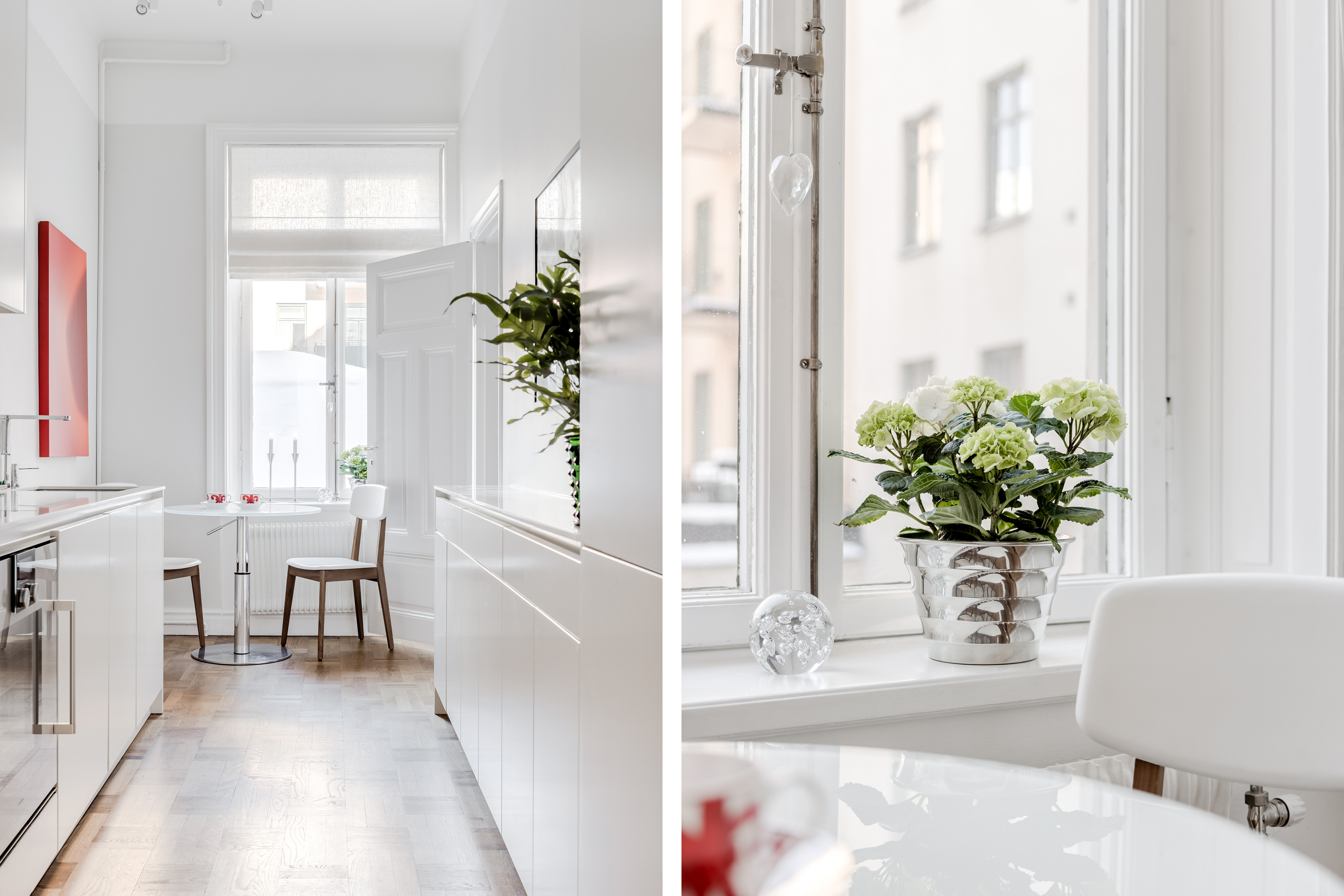
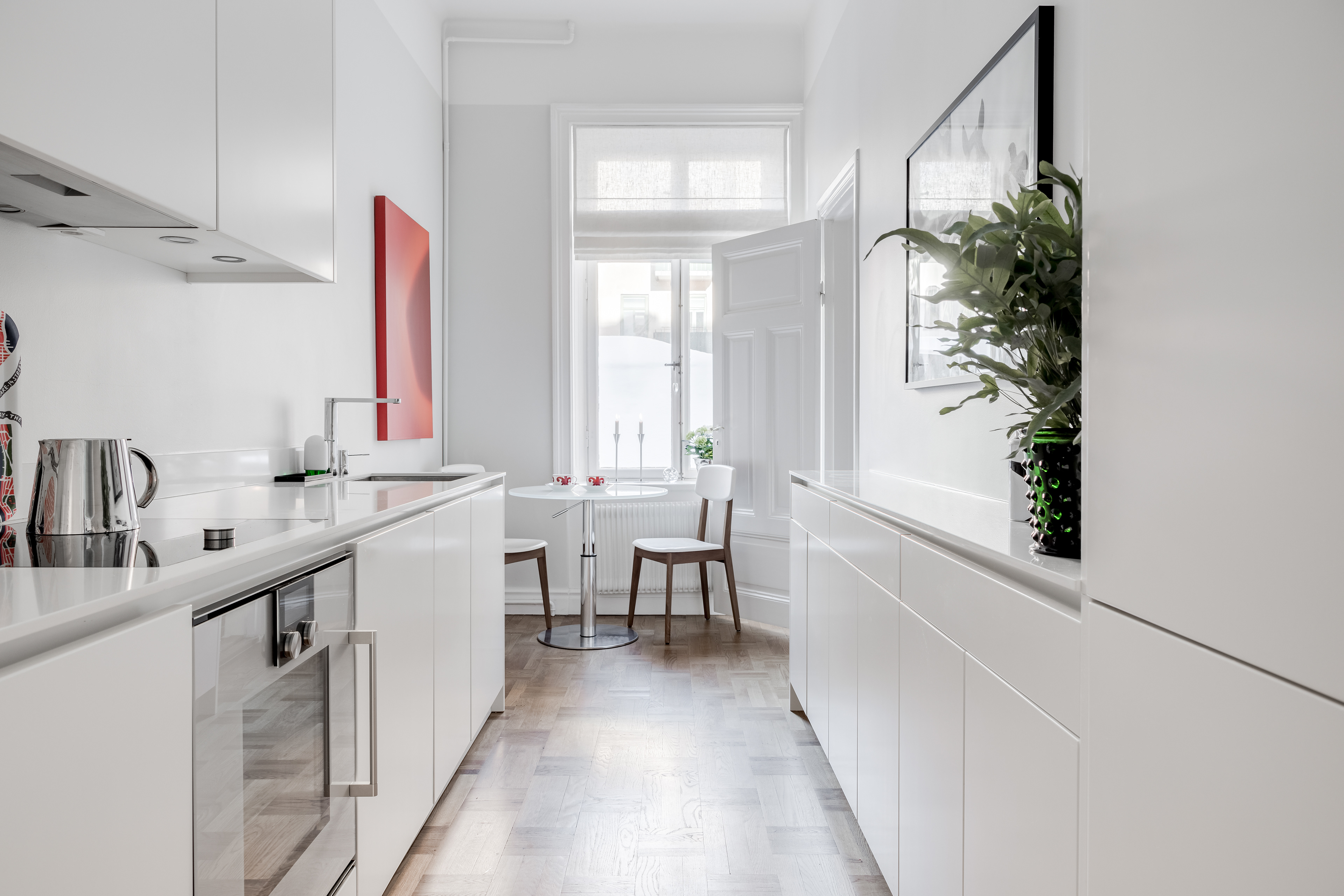
If you have some extra space in your kitchen I would definitely go for a smaller table like this. Although I love to have a big table where you can easily have dinner with friends (hopefully it’s possible again soon), I would be very happy to have both. The smaller one in the kitchen will be perfect to start your morning with a coffee or in the evening with a glass of wine when your'e making dinner and chat about your day with your partner.
Als je wat extra ruimte in je keuken hebt zou ik zeker voor zo'n kleinere tafel gaan. Hoewel ik het heerlijk vind om een grote tafel te hebben waar je makkelijk met vrienden aan kunt eten (hopelijk kan dat binnenkort weer), zou ik het heel fijn vinden om beide te hebben. De kleinere tafel in de keuken is perfect om 's ochtends aan te beginnen met een kopje koffie of 's avonds met een glas wijn als je het eten klaarmaakt en met je partner over je dag kletst.

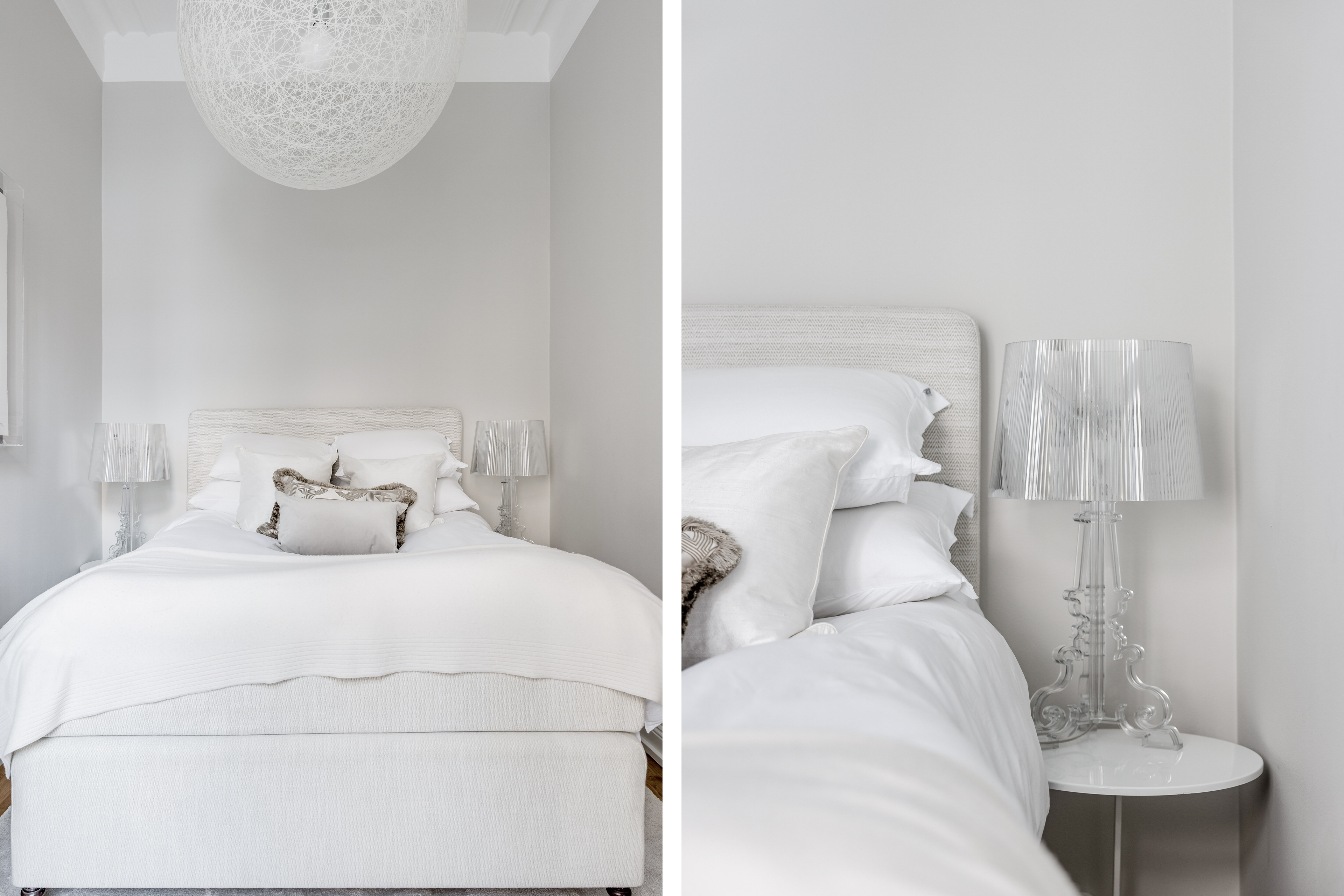
This is exactly how I love to see a bedroom, in all white and natural tones. It gives a relaxed feeling and in combination with the soft pillows and blankets it gives you a nice hotel feeling. Lately I’ve seen some bedrooms that have all beige/white/grey furniture and accessories and a taupe color on the walls. A few steps darker compared to this photo. I must say that it looks very nice and warm. For this room I understand that all light colors works best since it’s not very big.
Dit is precies hoe ik een slaapkamer graag zie, helemaal in het wit en natuurlijke tinten. Het geeft een ontspannen gevoel en in combinatie met de zachte kussens en dekens heeft het zelfs een beetje een hotelgevoel. De laatste tijd heb ik een aantal slaapkamers gezien met allemaal beige/wit/grijze meubels en accessoires en een taupe kleur op de muren. Een paar stappen donkerder dan het op deze foto is. Ik moet zeggen dat het er heel mooi en warm uitziet. Voor deze kamer begrijp ik dat alle lichte kleuren het beste werken aangezien het niet erg groot is.

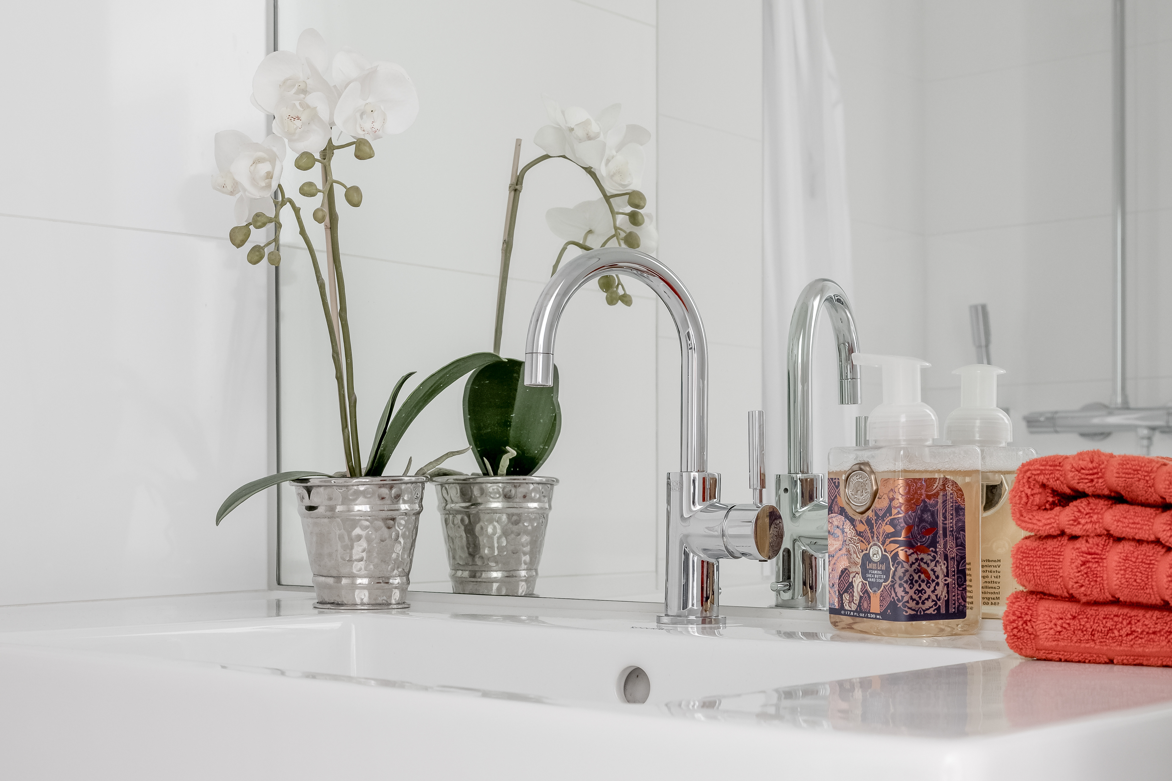
What a touch of orange can do. The basket with magazines, the towels on the sink in the bathroom and the bottle of soap. It does not need to be a lot to give some extra sparkle to a place. To add accessories like this can be very useful for a bathroom if you want to change the looks. It will get a bit expensive to change a crane or tiles often, but even in a bathroom you have the opportunity to create your style without major interventions. For my photos I often try to add some towels in similar colors at different points. Together with a plant or a candle it will look more complete.
Wat een vleugje oranje kan doen. De mand met tijdschriften, de handdoeken bij de wastafel in de badkamer en de fles zeep. Het hoeft niet veel te zijn om wat extra glans aan een ruimte te geven. Het toevoegen van accessoires als deze kan erg handig zijn voor een badkamer als je het uiterlijk wilt veranderen. Het wordt een beetje duur om vaak een kraan of tegels te vervangen, maar zelfs in een badkamer heb je de mogelijkheid om je stijl te creëren zonder grote ingrepen. Voor mijn foto's probeer ik vaak wat handdoeken in dezelfde kleur op verschillende plaatsen toe te voegen. Samen met een plant of een kaars ziet het er aangekleed uit.