Looking inside other people's homes often provides you with new insights. I regularly get inspired during my work. In this house I fell in love with the colors on the wall. It gives such an atmospheric look, yet the space retains the light and peaceful basis.
Binnenkijken bij anderen levert je vaak nieuwe inzichten op. Ik doe regelmatig inspiratie op tijdens mijn werk. Zo werd ik in dit huis helemaal verliefd op de kleuren op de muur. Het geeft zo’n sfeervolle uitstraling, maar toch behoudt de ruimte het licht en de rustige basis.
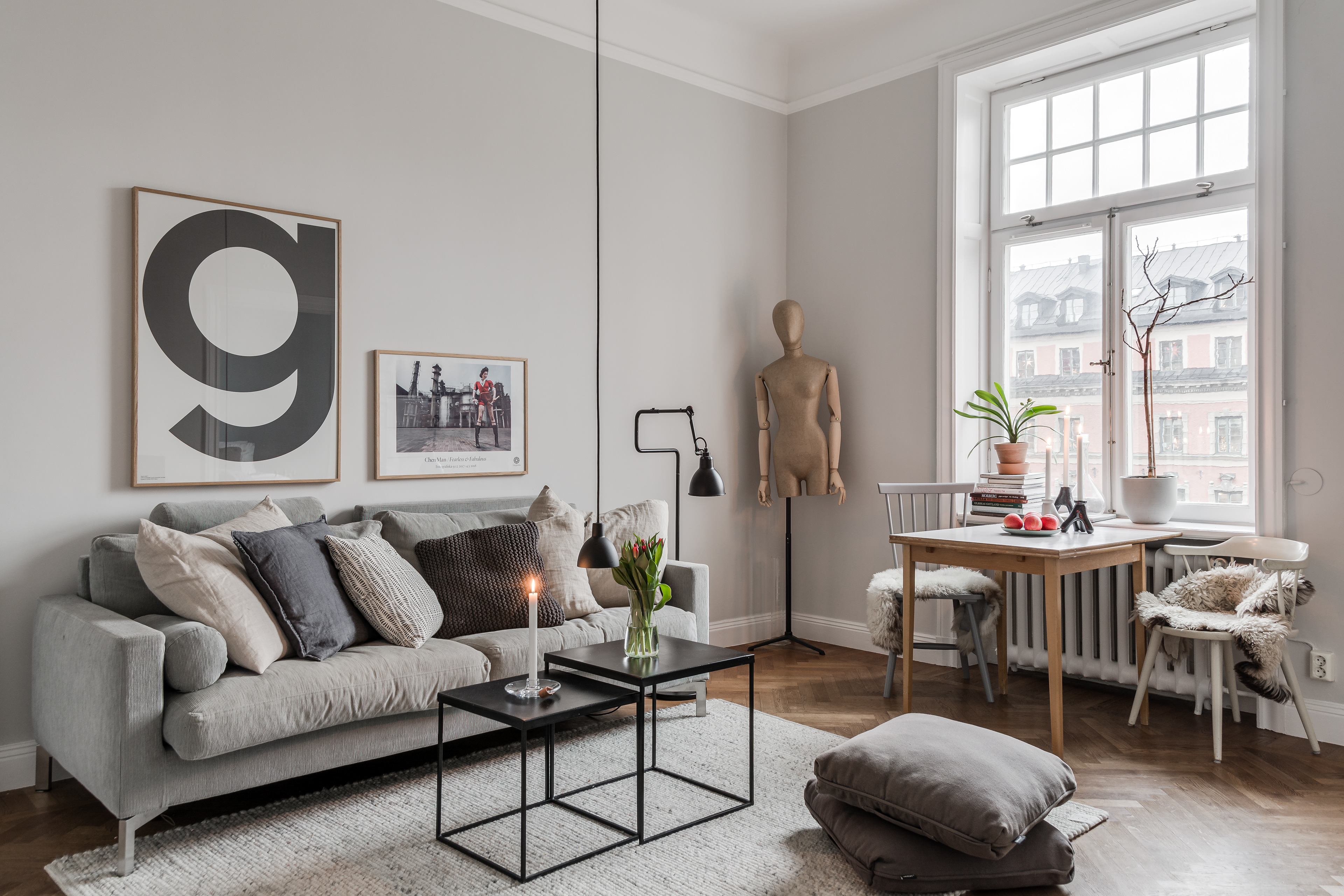
Where some people cheer for white walls, others loathe them. I myself belong to the category of people who prefer to leave walls white. However, I must admit that after seeing this apartment I changed my mind. There is of course a very wide palette imaginable between white and an intense color. As you can see here in the living room, a beige/gray color tone is used.
Daar waar de ene juicht bij witte muren, gruwelt de ander er weer van. Zelf behoor ik tot de categorie mensen die muren het liefst wit laat. Echter moet ik toegeven dat ik na het zien van dit appartement mijn idee daarvoor bijdraai. Er is natuurlijk nog een heel uitgebreid palet denkbaar tussen wit en een intense kleur. Zoals hier te zien is in de woonkamer is er gebruik gemaakt van een beige/grijs kleurtint.
Especially in a house where there are many beautiful frames, you can make them stand out by adding a different shade to the walls. The difference in color does not even have to be great to achieve the effect. I personally think this color works really well because it also adds some warmth. In this way the whole remains light, but not cold.
Zeker in een huis waarbij er veel mooie omlijstingen zijn laat je die er extra uitspringen door de muren van een andere tint te voorzien. Dat verschil in kleur hoeft niet eens groot te zijn om het effect te bereiken. Ik vind zelf deze kleur echt fantastisch werken omdat het ook gelijk wat warmte toevoegt. Zo blijft het geheel wel licht, maar niet kil.
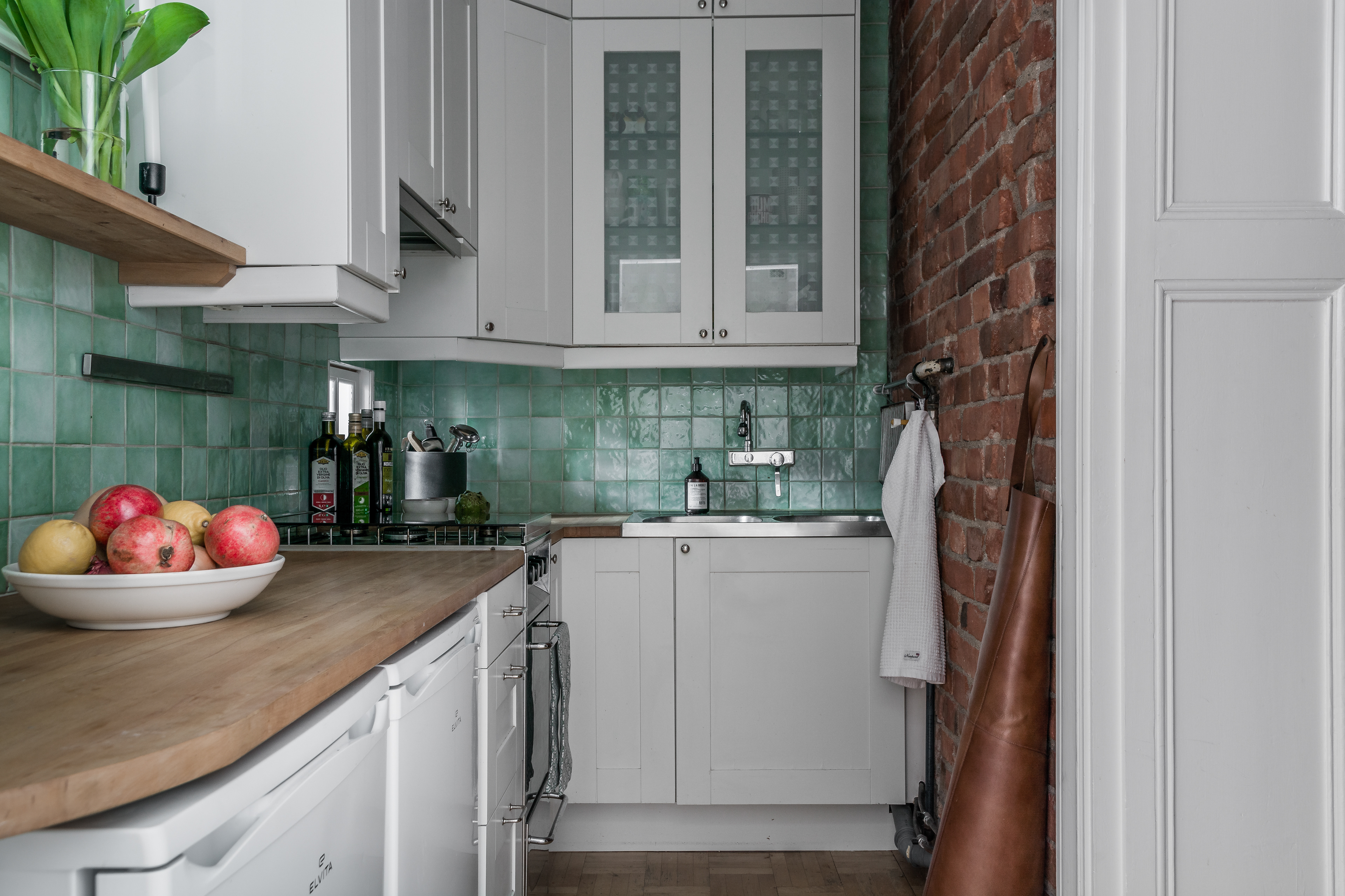
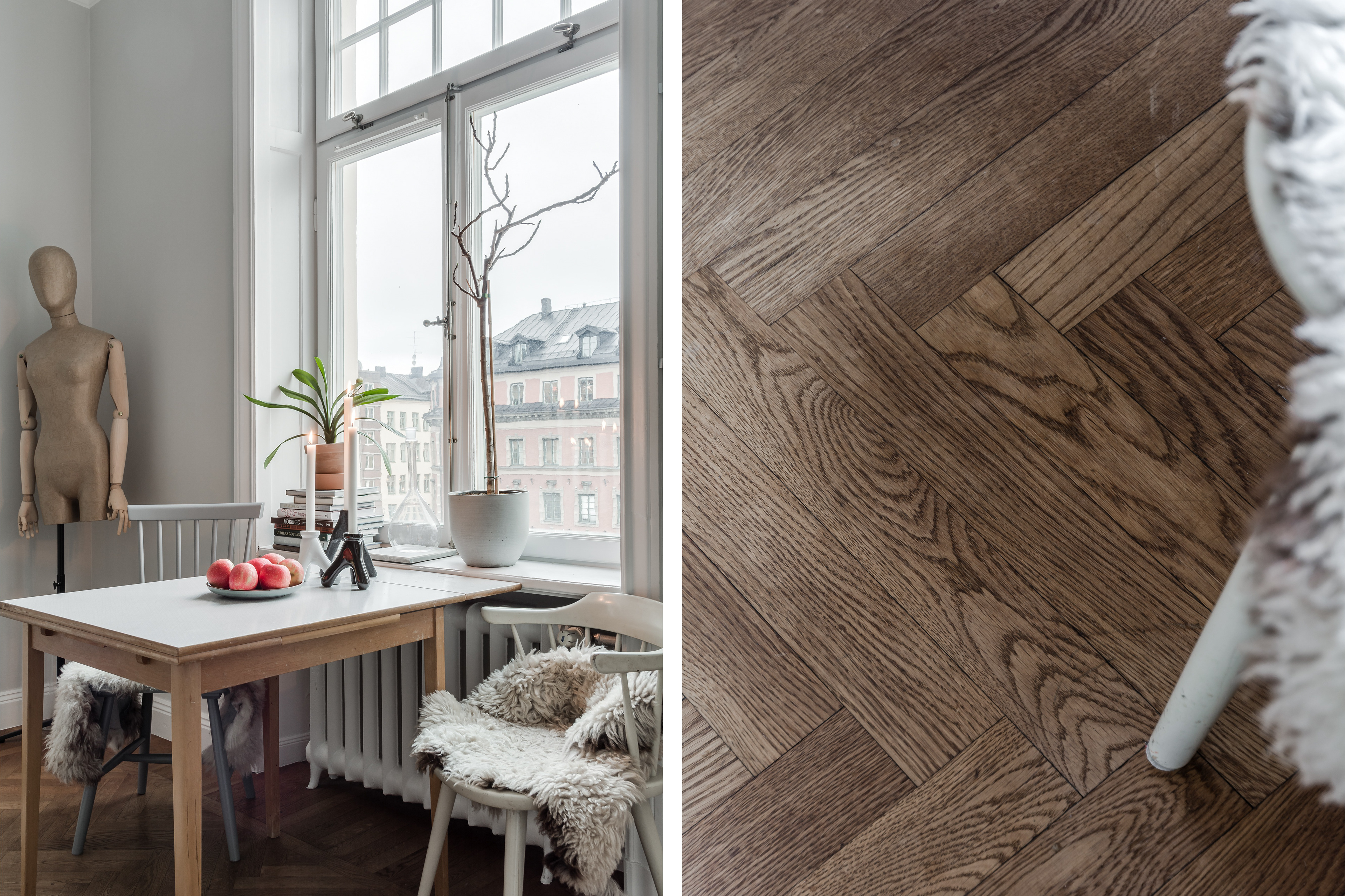
In older buildings you often come across nice details. Like here in the kitchen you can see a piece of the window behind the bottles of olive oil. On the other side is the bedroom and further on you can see a picture of the window from that side. It is small so you keep the necessary privacy and especially by the curtain hanging next to it, but still there is just a little extra daylight coming into the kitchen.
In oudere panden kom je vaak leuke details tegen. Zoals hier in de keuken zie je een stukje van het raam achter de flessen olijfolie. Aan de andere kant zit de slaapkamer en verderop zie je een ook foto van het raam vanaf die kant. Het is klein waardoor je wel de nodige privacy behoudt en zeker door het gordijn dat er naast hangt, maar toch komt er net even wat extra daglicht binnen in de keuken.
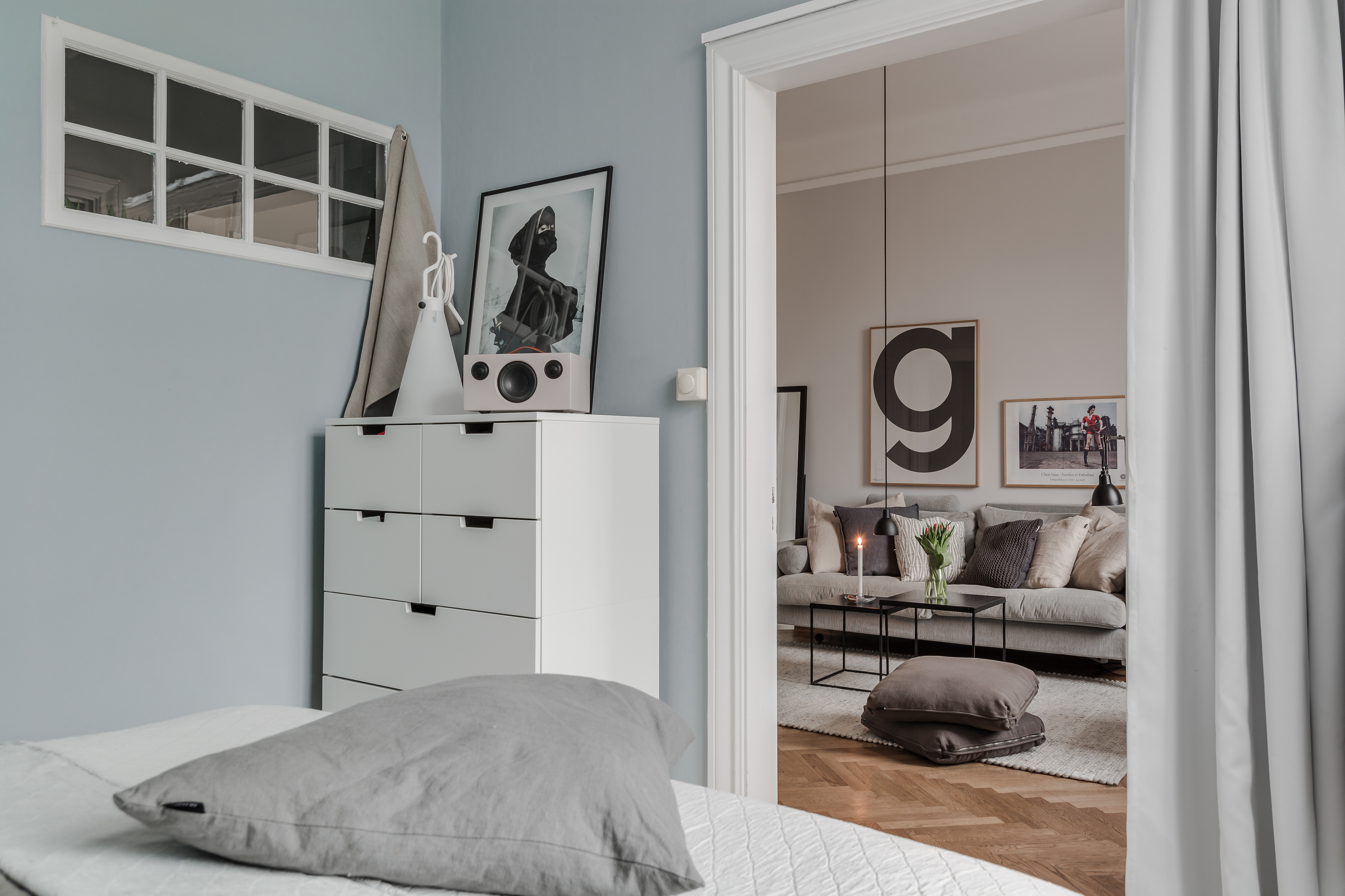
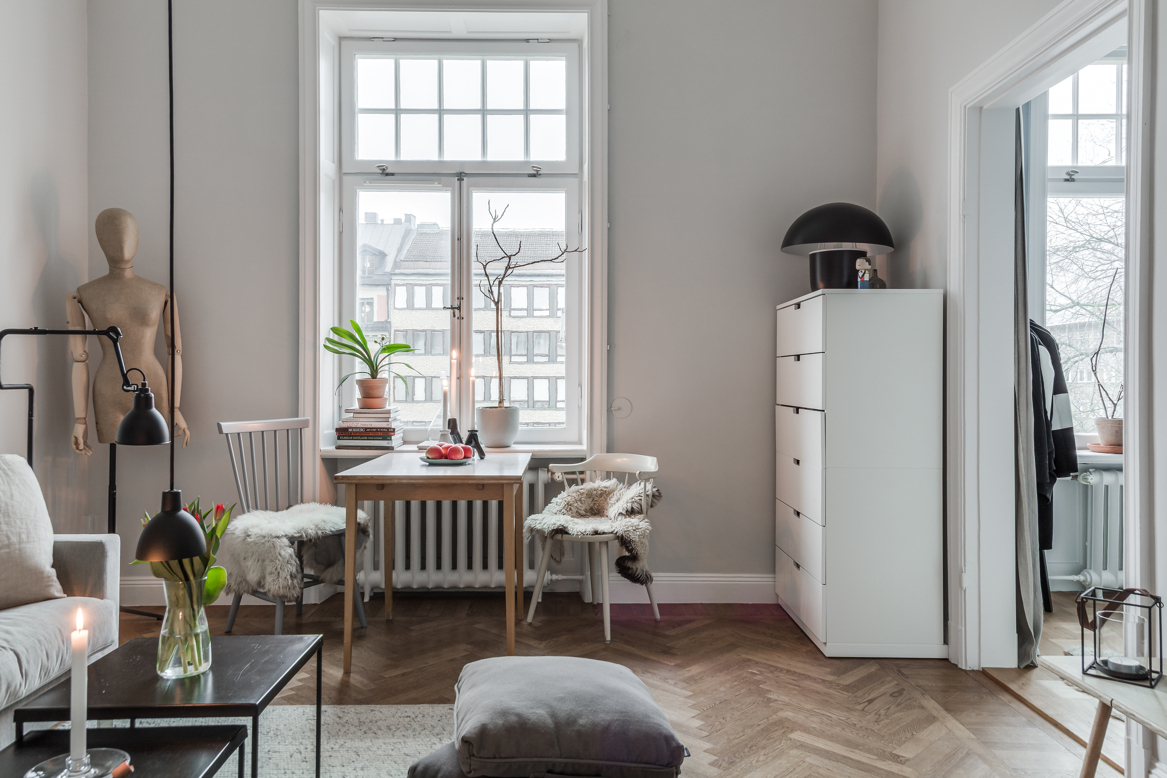
I always enjoy making photos like this, looking from one room to the next. On the one hand, it gives so much insight into the space and how everything is connected. On the other hand, it also provides playful photos where you share an additional experience of the space. It actually acts as a frame for what is visible from a distance. In this case you see how the bedroom is in contact with the living room. It strikes me that this happens much more often so openly in Swedish homes. While in the Netherlands bedrooms are much more often isolated from the rest. If it is near the living room there is often a door that separates the two spaces. To be honest, I love the open feeling and homes where many spaces are connected. Partly because of that, I notice that in Sweden bedrooms are given much more attention when it comes to decoration. It really is part of the living space.

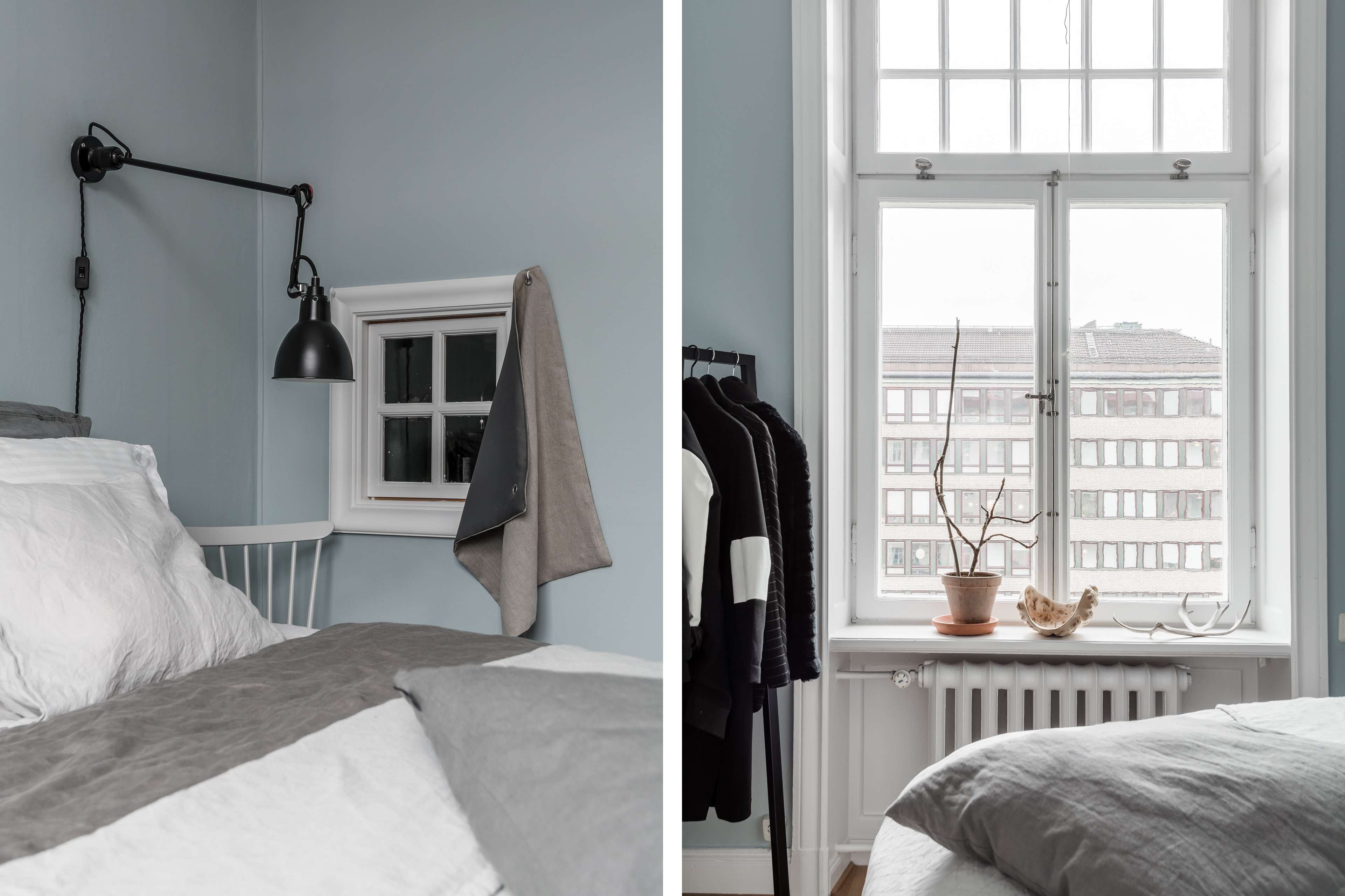
In the bedroom, a light shade of blue was chosen, which again goes very nicely with the taupe and gray tones of the pillows and accessories. On either side of the bed is a chair that serves as a nightstand. In my own home, I have it that way too. With us, it actually came from a surplus of chairs and not having a decent nightstand. Second hand chairs lend themselves really well to this. Depending on your style, you can paint the chair to match the rest of the interior. In our previous house I had a lamp clamped to the backrest and so there was still plenty of room for other stuff.
All the above photos are made by order of Erik Olsson.


